A consulting and financial management firm


Project detalis
Task
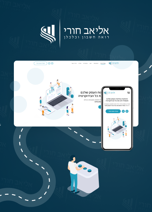
The task was to build a custom theme for the client’s accounting business. The website had to be modern, fresh, and able to load as fast as possible.
Problems
The client require a website which would accurately represent the company’s services and its approach in an attractive website. The website had to be in Hebrew and the content had to read from right to left (RTL).
Solutions
We designed and built all sections regarding the client’s content structure. We created custom illustrations and icons to demonstrate their approach – “let the experts handle the bureaucracy while you focus on your business.”

Final Product
Typography
Color palette
First Section
We believe that beauty is in simplicity. Here we created a 2-column section that was re-used over the website. Due to the minimalistic style, it is easy to consume the information and it doesn’t distract users from the main object on the website – the content.

Services
For the services, we made a list of plates with the corresponding icons that rotate on hover and show detailed information about the service.
Reviews
For the review section, we made a slider with the customer’s reviews and comments.

Contacting
Users can contact the office in different ways – they can leave their details and receive a quotation or they are able to make direct contact via email or messenger.

Professional training roadmap
This was one of the most important sections for the client where we demonstrated the company’s professional training roadmap and their experience in this field. It had to be unique and eye-catching.
Features
Advanced Custom Fields
Animation Effects
Custom theme
Fully Responsive
Icon Set
New Design
Services pages
Slider
Speed Optimization
Testimonials
Feedback


Great team to work with! They built the website as I imagined. I hope to work with them in the future ✌
Contact us

Interesting in working with us?
We create only high-quality and unique products that are convenient and easy to use. Everything we do, we do with love and dedication. Our sites bring profit to heir owners and delight to users.


