Icons Set Design
What is it?
What is the primary purpose of an icon?
A quick grasp of meaning. The human eye processes visual images much faster than text. It is also a universal way of understanding information in any language. Therefore, the more accurate the metaphor of your icon, the faster it will be “read”. And this is the first thing you should pay attention to when creating icons.
We won’t talk in detail about what makes a good icon, but if you want to read something about it, look at the end of the article – you’ll find the most frequently asked questions there.
Featured case
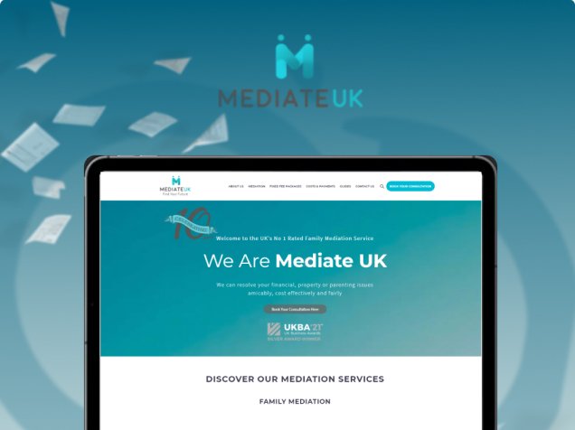
Mediate UK Project
We redesigned a set of icons for the client re-drawn from scratch to make it feel more natural and aesthetic.
FAQ
Of course, you can, but it’s vitally important to be recognizable and stand out among competitors and not rely on old icons used by many.
We are a team with fresh ideas that implements creative solutions to make your software attractive and your company’s image unique.
The process of developing icons consists of next steps:
- Finding the most appropriate style.
- Creating icons as multiple thumbnails.
- Coordination of the final version with the client.
- Refine the design of icons.
It will be easier for the user to recognize menu items and sections and the behavioral factor of your site will increase.
Pictures are more memorable than words. Beautiful icons are small in size but will diversify any page and make it visually more attractive.
Contact us

Interesting in working with us?
We create only high-quality and unique products that are convenient and easy to use. Everything we do, we do with love and dedication. Our sites bring profit to heir owners and delight to users.


